The Morning the Data Turned#
On November 4, 2020, the Ethiopian federal government launched a military offensive against the Tigray People's Liberation Front in the country's northern Tigray region. The TPLF had governed Ethiopia for nearly three decades before being displaced from federal power in 2018; the conflict that erupted that November was the product of accumulated political tensions, ethnic mobilization, and competing territorial claims. In its early weeks, it looked like yet another African civil war — serious, but manageable by the grim standards of the continent's recent history.
By 2022, it had become the deadliest conflict in the world. UCDP v25.1 records battle deaths in Ethiopia during the Tigray war at figures that, combined with simultaneous escalation in Ukraine, produced a global total of approximately 237,000 battle-related deaths for the year. That number had not been exceeded since the final years of the Cold War's most destructive proxy conflicts. The declining curve that Gleditsch and colleagues had documented, and that the 2005 Human Security Report had celebrated, had not merely stalled. It had reversed.
This post follows the data from 2001 to March 2026: what the UCDP's updated dataset records, what it cannot yet capture, and what it reveals about the architecture of a world far more violent than the scholars of 2002 had reason to expect.
The S-Curve Has an Inflection Point#
The optimism of the early 2000s was grounded in a real and measurable decline. Understanding the reversal requires accepting both truths simultaneously: the decline was genuine, and the reversal is genuine. UCDP v25.1 does not lie. Neither did the original dataset. What changed was the world.
The 2022 death toll is not an outlier corrected by subsequent years. It is the beginning of a new pattern — one in which high-intensity conflict has returned to the European continent for the first time since the Yugoslav wars, in which Sub-Saharan Africa sustains simultaneous crises across multiple countries, and in which the Middle East has generated a conflict so dense that its casualties, measured against the population of the territory affected, rival the recorded rate of the Rwandan genocide. The numbers that follow are not rhetorical. They are the UCDP's findings, supplemented by verified sources where the dataset ends.
The Numbers That Rewrote the Trend#
A Decade of Escalation in Sequence#
The global battle death count in 2019, the year before the Tigray offensive began, was approximately 52,000. That figure placed it near the post-Cold War low — consistent with the declining trend that the 2005 Human Security Report had documented and projected. It seemed to confirm the trajectory.
By 2021, as the Tigray conflict escalated toward full-scale war, the global total reached approximately 120,000. The following year, 2022, brought the combination of Tigray at peak intensity and the Russian invasion of Ukraine, launched on February 24. Together, they pushed the global total to approximately 237,000 — a 48% increase over any year between 1993 and 2019. In 2023, as the Tigray conflict wound toward ceasefire and Ukraine's front lines stabilized into attritional warfare, the global total fell to roughly 122,000 — partly because Gaza's mass casualty phase had only just begun in October of that year. In 2024, the ongoing combination of Ukraine, Sudan, Gaza, and the Democratic Republic of Congo produced approximately 160,000 battle deaths.
The UCDP dataset ends at 2024. But verified sources extend the picture. In 2025, with the Gaza ceasefire temporarily holding from January onward and no major new conflicts opening, the global total fell substantially — to an estimated 35,000 — primarily reflecting a partial deescalation in the world's most active theatres. Then, on February 28, 2026, the United States and Israel launched coordinated strikes against Iranian nuclear and military infrastructure. By Day 31 of what conflict trackers were calling the Iran-Israel-US War, verified killed totals stood at 1,937 in Iran, 1,238 in Lebanon, 20 in Israel, and 13 among US forces — a combined 3,334 deaths in 31 days, with active operations ongoing.
Why the Mechanisms of Peace Proved Insufficient#
The theoretical framework that made the early-2000s optimism coherent assumed that the forces making for peace — democratization, economic interdependence, international institutions — would continue to accumulate. They did not. Freedom House's annual Freedom in the World report recorded its seventeenth consecutive year of global democratic decline in 2023. The number of countries rated "Not Free" reached its highest level since tracking began. The institutional architecture of the post-Cold War liberal order — the UN Security Council, the International Criminal Court, the Responsibility to Protect framework adopted in 2005 — did not prevent any of the major atrocities of the 2010s and 2020s.
The structural reason is legible in the UCDP data itself. The dataset distinguishes between conflict types: international, internationalized intrastate, intrastate, and extrastate. The post-Cold War decline was driven primarily by the reduction in internationalized intrastate conflicts — civil wars with external state involvement — as Cold War patron-client relationships dissolved. What returned after 2014 was a structurally different phenomenon: high-capability states willing to directly use military force across borders (Russia–Ukraine) or to sustain prolonged high-intensity operations in contested territories (Israel–Gaza), combined with regional powers funding armed groups at scale in fragile states across Africa and the Middle East.
The UCDP's 25-death threshold, designed to capture politically significant violence, is now measuring conflicts where single-day death tolls regularly exceed that annual floor. On some days in 2022, Ukraine alone produced more than a thousand battle-related deaths. The threshold that once seemed usefully sensitive is now a floor well below the operational reality of the conflicts it is trying to measure.
A New Geography of Violence#
The geographic distribution of conflict has also shifted in ways the 2002 map did not predict. Sub-Saharan Africa has emerged as the region with the highest share of global battle deaths in the most recent years, driven by the simultaneous activation of high-intensity conflicts in Ethiopia, Sudan, the Democratic Republic of Congo, and the Sahel. This is not a new finding — the UCDP's original S-curve always showed Africa as persistently conflict-affected — but the scale and simultaneity of the current crises is qualitatively different from the episodic conflicts of the 1990s.
Europe returned to the conflict map after a generation's absence. The Russian invasion of Ukraine produced a European land war at scales not seen since the 1940s, with trench systems, artillery exchanges, and drone campaigns across a front line stretching hundreds of kilometers. For two consecutive years, Ukraine contributed more to the global battle death total than any single country since the height of the Afghan and Iraqi campaigns.
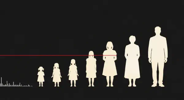
The Middle East accelerated in both intensity and geographic spread. The Gaza conflict, which began on October 7, 2023, produced casualties at a rate that UCDP's raw death count could not fully convey. This is where the dataset's structural limitation — identified by Gleditsch and colleagues in 2002 — became analytically critical. Ranking Gaza eighth in the table of deadliest conflict-years for 2024 while recording approximately 21,465 battle deaths said something real. But it did not say what mattered most: that those 21,465 deaths occurred in a territory of 2.3 million people — a density of killing that placed Gaza in a category shared with almost no other modern conflict.
What the Scholars Got Right, and What They Could Not Have Known#
Gleditsch and colleagues were right that the post-Cold War decline was real. They were right that measuring conflict with a low threshold captured politically significant violence that higher-threshold datasets obscured. They were right that the mechanisms of peace — where they functioned — were genuinely effective. Their dataset identified the trend correctly. Their projections were reasonable given the data they had.
What they could not have known — and what the UCDP's own "Future Improvements" section gestured toward without resolving — was that the world would produce, within two decades, conflicts where the distance between "battle deaths" and "demographic cost" would reach historic extremes. They noted, in 2002, that studying war's human cost required "more accurate casualty statistics." They flagged the Kosovo conflict, where NATO countries appeared in the dataset as full war participants despite suffering fewer than 25 military deaths, as evidence that incidence-based measurement had limits.
Twenty-five years later, the limit is visible not in a minor anomaly but in the central conflict of the era. Gaza's position in the UCDP death table — eighth in 2024, behind larger-population conflicts that produced similar absolute counts — is not wrong by the dataset's own standards. It is simply incomplete. Completing it requires a different metric: one that divides the deaths by the population and measures what fraction of a people has been consumed.
That metric — the Human Cost Index — is the subject of the next post. Its companion, the Casualty Rate, measures not just how much has been lost, but how fast. Together, they finish an argument the Uppsala scholars began in 2002, in a world that has since given them more evidence than any of them wanted.