A Hopeful Room in Uppsala#
In June 2001, a group of conflict researchers gathered at Uppsala University for a conference with an unglamorous title: "Identifying Wars: Systematic Conflict Research and Its Utility in Conflict Resolution and Prevention." The paper they presented — published the following year in the Journal of Peace Research — was not written for a general audience. It was dense with methodological definitions, coding rules, and statistical caveats. Yet its core message carried a quality rarely found in academic conflict research: genuine, evidence-based grounds for hope.
The dataset the researchers introduced — the Uppsala Conflict Data Project, backdated to cover every armed conflict from 1946 to 2001 — documented 225 discrete conflicts over five and a half decades. At the height of post-Cold War turbulence in 1992, 55 conflicts were active simultaneously. By 2001, that number had dropped to 34. The long curve of political violence, charted with the most rigorous methodology then available, appeared to be bending downward. Nils Petter Gleditsch, Peter Wallensteen, and their three co-authors were too careful to call it a trend. But the direction of the data was unmistakable.
The mistake would be to dismiss that optimism as naive. It was not. It was the conclusion best supported by the most comprehensive conflict data in existence. What followed over the next twenty-five years would not prove the scholars foolish. It would prove the limits of projection — and reveal what their framework could not yet measure.
The Evidence Was Genuinely Compelling#
This series argues that the academic optimism of the early 2000s was not wishful thinking. It rested on methodologically sound data, a coherent theoretical framework, and institutional confirmation from multiple independent sources. The UCDP dataset said conflict was declining. SIPRI's military expenditure data confirmed the trend. The 2005 Human Security Report extended the analysis and strengthened the conclusion. For scholars who had spent careers documenting atrocity, the convergence of evidence offered something rare: a case for hope that could be defended in a peer-reviewed journal. Understanding why they believed it — and what the framework missed — is the necessary first step before confronting what the data now shows.
The Architecture of a Generation-Defining Dataset#
The Choice of a Lower Threshold#
The UCDP framework rested on a deliberate methodological decision: it counted any armed conflict producing at least 25 battle-related deaths in a single year, with at least one party being a recognized state. The rival framework — the Correlates of War project's 1,000-death minimum — had long served as the field's gold standard, but it excluded conflicts that were politically significant even when they fell below the body-count threshold. The Basque conflict, with its campaign of targeted assassinations, never qualified. Northern Ireland, which exceeded 25 annual battle deaths every year from 1971 to 1993 and killed more than 3,000 people in total, did not meet the COW threshold either.
By lowering the entry point to 25 deaths per year, the UCDP captured a fuller picture of organized political violence — and created a larger, statistically richer dataset that could support more nuanced analysis. The decision was not merely technical. It encoded a moral premise: that the suffering caused by smaller conflicts deserved to be counted, even when it did not register in the vocabulary of "war."
The Backdating Project#
The 1946–2001 dataset itself was a major scholarly achievement. Researchers generated a candidate database of 4,219 conflict events drawn from a dozen prior datasets, then systematically verified each against Keesing's Contemporary Archives and country-specific reference literature. Particular attention went to disentangling complex situations — Burma and India, where multiple overlapping insurgencies had been lumped together in prior datasets — into coherent analytical units.
The result was the first truly longitudinal picture of global armed conflict at a methodologically consistent threshold. When plotted across time, it produced a recognizable shape: a slow rise through the Cold War period to a peak of 55 active conflicts in 1992, followed by a steep decline. A third-order polynomial fitted to the probability that any given country would be in armed conflict in a given year showed an S-shaped curve — a steep early drop during the Korean War era, a long plateau through the Cold War's middle decades, and a decisive downward turn at the end. It was the visual grammar of progress.
The Practical Limits of the Methodology#
The framework had one structural limitation its authors acknowledged but could not resolve: it measured incidence, not demographic intensity. The dataset recorded whether a conflict was active in a given year and whether it met the thresholds for "minor," "intermediate," or "war" classification. It could not capture the full distribution of suffering within those categories. A conflict that killed 800 people in a year was "minor." A conflict that killed 800,000 in three months occupied a separate analytical box entirely — when those deaths were civilian massacres rather than battle-related, they could fall outside the dataset's scope altogether.
Rwanda in 1994 illustrates the boundary condition precisely. The UCDP coded Rwanda as having an "intermediate" armed conflict that year, because the battle-related deaths between organized forces — the Rwandan government and the Rwandan Patriotic Front — met that calibration. The 500,000 to 800,000 Tutsi and moderate Hutu civilians killed by Hutu militia in 100 days were explicitly excluded. As the dataset's own footnote stated: "The deaths are not classified as battle-related and are not included in this study." In 1994, the world's fastest genocide registered as an intermediate conflict.
This was not a flaw in the UCDP's mission. It was a scope decision, carefully explained and consistently applied. The researchers were measuring organized armed conflict between politically motivated parties. They were not designing a general theory of mass atrocity. But the gap between "battle deaths" and "human cost" — visible in Rwanda in 1994, present but latent in dozens of other cases — would widen dramatically over the following two decades.
When the World's Institutions Agreed#
The UCDP findings did not exist in intellectual isolation. They arrived embedded in a theoretical framework that made the decline comprehensible, and that framework was gaining empirical support from multiple independent directions simultaneously.
The democratic peace thesis — the proposition that liberal democracies rarely go to war with one another — was, by 2002, one of the most replicated empirical findings in international relations. Bruce Russett and John Oneal's 2001 synthesis, Triangulating Peace, had marshalled decades of evidence that democracy, economic interdependence, and membership in international organizations each independently reduced the probability of armed conflict. The post-Cold War spread of democratization offered a structural mechanism for the decline the UCDP was measuring: more democracies meant fewer wars, through a logic that connected domestic political institutions to international behavior.
SIPRI — the Stockholm International Peace Research Institute — tracked military expenditure alongside conflict data and confirmed the broader pattern. Defence budgets were falling across the developed world. Peacekeeping operations under UN mandates were expanding. The institutional architecture that Russett and Oneal had identified as peace-promoting was growing more extensive and more global.
Then, in 2005, the Human Security Centre at the University of British Columbia published the Human Security Report, which extended the UCDP analysis through the mid-2000s and drew the most ambitious conclusion yet. The number of armed conflicts had declined by 40% since the early 1990s. Genocides had fallen by 80%. Battle deaths per conflict were dropping. The report drew explicitly on the UCDP framework, updated its findings, and reached conclusions that moved beyond academic journals. UN Secretary-General Kofi Annan cited its findings. A generation of policymakers absorbed its message: international institutions were working, and the world was, measurably, becoming less violent.
The 2005 Human Security Report was not naïve. It acknowledged continuing crises, the persistence of civil war, and the possibility of new forms of violence. But its intellectual framework was progressive. The mechanisms of peace — UN peacekeeping, the spread of democracy, the deepening of international law — were functioning. The declining curve had a causal explanation, and that explanation pointed toward continuation.
The Hopeful Room, Reconsidered#
The scholars who gathered in Uppsala in 2001 were not making predictions. They were describing historical patterns and proposing theoretical frameworks to explain them. The democratic peace was real. Conflict counts had genuinely declined. The post-Cold War moment was, by every measurable metric, less violent than the peak years of the Cold War's proxy conflicts. They were right about all of this.
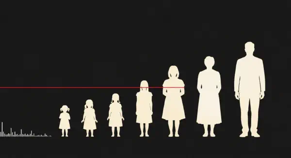
What the framework could not capture was the qualitative transformation in how wars were fought and against whom. The UCDP counted conflicts; it did not yet have the tools to weight them by the proportion of a population they consumed. A conflict that killed 50,000 people in a country of 500 million was recorded alongside a conflict that killed 50,000 in a territory of two million. In the dataset, they looked similar. In the lived reality of the populations involved, they were not the same event.
The theoretical mechanisms the 2005 Human Security Report identified — democracy, interdependence, international institutions — proved necessary but insufficient. They functioned most reliably in the world that the dataset knew: conflicts between states, with clear lines between combatants and civilians, fought with armies that had supply chains and surrender protocols. They functioned less well in the world that was coming: conflicts characterized by radical asymmetry in military capacity, conducted partly through siege and starvation, in territories where the distinction between combatant and civilian was deliberately obscured by one or both parties.
Between 1946 and 2001, conflict researchers counted 225 armed conflicts. The declining curve was real. The mechanisms of peace were real. But by 2022, in a single year, a combination of the Tigray war in Ethiopia and the Russian invasion of Ukraine would produce more battle deaths than any year since the end of the Cold War. By early 2026, a new interstate conflict in the Middle East had opened on top of an ongoing campaign in Gaza where a population smaller than Chicago had already lost more than 3% of its people.
The third-order polynomial showed where the curve had been. It could not show where it was going. The next post follows the data from where the optimism ended.